
Essence of design
My name is riki moe (りき萌), and I'm one of the people behind kemo-star, a small company creating websites for businesses and individuals. I do most of the user interface and user experience (UI and UX) design work on our websites.
This blog post writes down the philosophy behind our design work, for everyone to learn what makes our websites fun and unique, and also for our own reference in the future.
Old but gold
One of the key rules I apply in kemo-star's website designs is “old but gold.”
What I mean by that is, there is a lot of knowledge and wisdom encoded in the design decisions of old user interfaces, that most modern designers seem to ignore, to instead chase what looks fashionable, or is cheap to implement. (Which is, to be honest, mostly just whatever Apple does.)
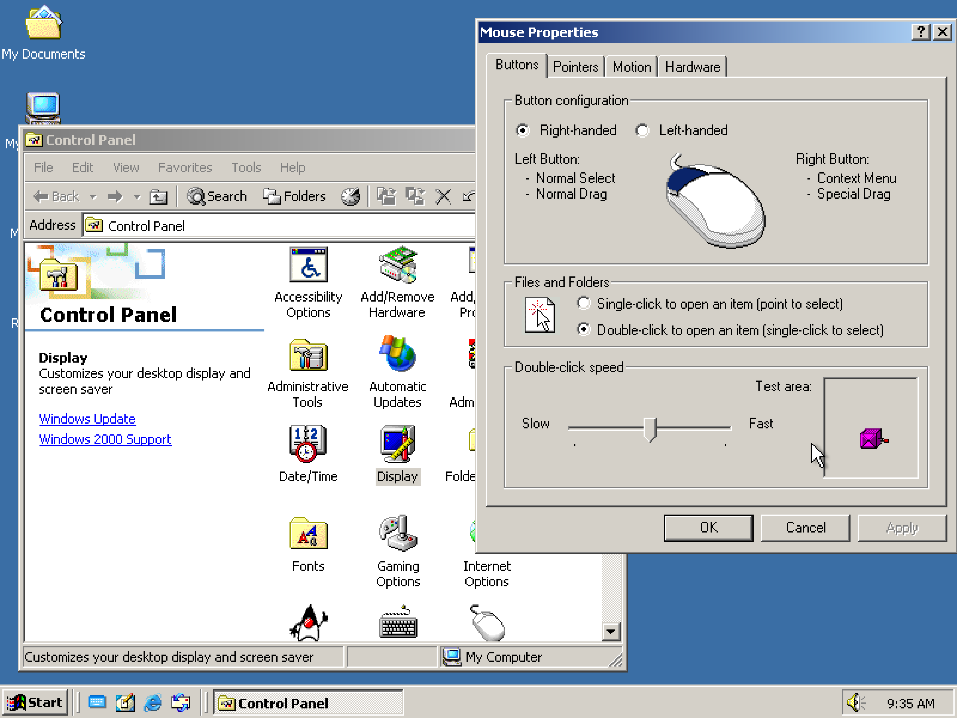
This is Windows 2000. It looks quite dated and simplistic, but there are a lot of little design decisions that make it very good at being immediately readable, with parsimonious use of screen space.
Buttons are clearly delineated, with bevels to suggest they can be pushed down. They are compact, because the borders make it so that they can be compact without being ambiguous—saving precious screen space on this little 800×600 pixel display.
(The examples in this post are interactive—feel free to play around with them, click the buttons! They'll react visually to your clicks.)
Contrast this with what's commonly done in modern design, which is to simply apply a coloured background to the buttons.
You might look at this and say, “but it looks better!” Except by removing those borders, you've lost a lot of contrast against the background. With this little contrast, you also need to be extra careful to make disabled buttons contrast well against functioning ones—which I've omitted in this example, because removing any extra contrast from the text will make it borderline unreadable.
In the settings dialog box, related functionality is sectioned off into clearly visible groups with rectangles around them. Tabs resemble real world tabs, like in a notebook—suggesting you can open them by clicking on them.
Button configuration
Files and Folders
Contrast this with what a more modern incarnation of the same UI might look like. This particular sketch was inspired by Atlassian's UIs from Jira and Confluence:
Button configuration
Files and Folders
This is my design, of course, so this might look like I'm setting up a straw man, but I tried to inspire myself off of Jira's look and feel from memory.
There are good things with the more modern design: the radio buttons are much larger, making them easier to click, there are hover styles, communicating that the widgets are interactive when you mouse over them, and the use of colour makes the UI look more inviting (although I think blue is quite overused in brands' palettes).
But at the same time, how are you supposed to tell these are tabs without clicking on them? I've seen this design time and time again, and I can never understand why anyone would opt for it, other than that it's cheaper to make (it takes less time to design and lines of code to write). Same with the buttons.
I was also forced to add a lot of extra padding to communicate the same visual hierarchy. Sure, there are less lines, but there's also a lot more wasted screen space that the user could fill with other important things. Or that you, the designer, could fill with other important things.
Not to mention, that this UI is devoid of character: it is the simplest, cheapest thing I could come up with. It took me marginally less time to create than the Windows 2000-styled UI, partially because I wasn't really recreating an existing design, but also because there was no space for fun and whimsy in the design. All the lines look the same, all the colours are flat. It is purely utilitarian, and no voice shines through.
Either way, modern design tends to end up throwing away lots of useful knowledge from the old times—which I think is bad! And is why I want kemo-star to keep in mind that design wisdom from the olden days. The paths trodden by the generations of the past.
Windows 2000 doesn't look good by today's standards, and doesn't look whimsical enough to satisfy me, but the designers sure knew what they were doing.
Skeuomorphism and whimsy
A decade after Windows 2000, Apple released the iPhone. Hardware has come a long way since the early 2000s, and it was now feasible to display richly-styled UIs resembling objects from the real world.

I couldn't find a higher resolution screenshot, and Apple doesn't let you downgrade your iPhone…
But anyways.
This was great for initial adopters of Apple's phones, because it created a cognitive bridge between the touchscreen and people's knowledge of how to use real objects. People could read the UIs more easily, because they looked like things they had already used in the real world—such as a bookshelf.
This concept is called “skeuomorphism”—in the context of UI design, it is the act of making UI elements feel more familiar by making them look like real world objects.
I personally think these renditions often look really interesting visually, if a little too gaudy and glossy for my own taste.
I mean, is there really a reason not to make the button for publishing a website a huge red button that screams “this does something important”?
Or, why not add a realistic rendition of a smartphone to your homepage, and make its clock update live to match the actual hour? (That's something from our homepage!)
To me, these sort of touches make the UI feel more whimsical and human—something I feel we need more of in a world where corporations increasingly try to take the human out of the equation. Where reality is being taken away from us, kemo-star tries to relate its UIs more to it, so that none of us forget what a beautiful world we live in.
Full of inventions and doodads such as buttons, sliders, knobs. Calipers, staplers, stamps. Paper sheets, envelopes, scissors. Heck: even big things like lamps, fridges, microwaves.
We want to celebrate that world in our design.
Pragmatism and stability
kemo-star designs are pragmatic, in that they aim to avoid getting out of your way. We design our websites to help you get the job done: help you find the information you need, or carry out the task you want to get done, in the simplest, smoothest, fastest way possible.
Our contact form is a great example of this, where we aimed to reduce obstacles by limiting it to just a few fields: your email address, optionally your current website, and then freeform inquiry content. You choose the details to include in your inquiry, because on the other end are a bunch of humans, not machines—we don't need to know a subject line, a category, or even your name or telephone number, to be able to process your request. We'll ask for it if we need it—what matters is that you don't get stopped by a contact form that's too procedural and rigid.
kemo-star designs are also stable. They're stable like a foundation of solid concrete, in two ways.
The first way is that when you're carrying out your task, the foundation will not wobble like an unstable ladder. Have you ever selected something on a website, and a popup appeared trying to provide you with helpful options? These kinds of little popups, distractions, and visual obstructions add to the sense of instability.
Excessive animations also add to that sense. We use them sparingly, where they do not introduce too much motion into the viewport. Buttons can animate on push for extra juice, but they won't introduce entire view transitions, because that feels less stable, and slows you down. The less elements are moving across the whole screen, and the more static the UI is, the better.
One time I found myself needing to adjust a bunch of events in Google's calendar, and having to wait for the details window to carry out its little slide-in animation was quite frustrating.
The other way our designs are stable, is that we think them through. They will not change senselessly just because we felt we needed to “refresh the UI” and “remove distractions”. We prefer to evolve, not revolve.
This sounds quite conservative, but we feel like for the average user, who does not spend hours in front of the computer each day, this is the best course of action. By necessity, this means our UIs will probably become dated more quickly, but we hope to alleviate that by creating designs that are original and unusual—thus not being affected so much by current trends.
When that same user decides to come back and edit their website after a year, they will not want to read the entire manual again just to figure out where a button went. The best case scenario is that the button did not go anywhere—it's still where it used to be.
Accessibility and reliability
Although to many accessibility might seem like it has a fairly narrow purpose, such as helping disabled people, the reality is that web accessibility touches every single one of us. For example, have you ever been forced to use an older phone or computer, or browse the web on a poor Internet connection?
We cannot afford to exclude these people from accessing the Web, which is why we take accessibility seriously. This means designing our websites with high contrast on all elements, testing our websites on less powerful hardware, and with slow Internet.
Due to the huge range of conditions people may be affected by we can't cover everyone, but we try to the best of our ability.
Reliability is a related problem, because an unreliable website can also become inaccessible. Just this year, I had to send some packages through FedEx, and their website was one of the worst and inaccessible experiences I've had. Half the time I wasn't even able to log into my account due to cryptic errors, and when I did log into my account, I could not access the website from a mobile device, because the page did not display its content properly.
I was forced to reapply for their “last minute” offer several times due to changes in my schedule, having to input my five packages' sizes and weights every single time, only to be faced with a failing login screen again.
That's how poor reliability becomes an accessibility problem, and we want to avoid that at all costs.
We want to make sure users won't turn to you with complaints about your website not working. Because we care, and we want to make it work well.
This concludes the essence of kemo-star's design. I presume we will publish further posts with more examples or rules as our company grows.
If you're interested in getting a website according with this philosophy, be it as small or as big as you please, come and have a look at our offer. Who knows—perhaps kemo-star can be the one company that'll make you love your computer!